The Los Angeles Times had a poll which was interesting because I was always up in that poll. They had something that is, I guess, a modern-day technique in polling, it was called “enthusiasm”. They added an enthusiasm factor and my people had great enthusiasm, and [Clinton’s] people didn’t have enthusiasm.
Donald Trump (Source: NY Times)
An infamous failed election prediction
One of the many bizarre aspects of the 2016 US Presidential Election was that so few people correctly predicted the outcome from polling data, including statisticians at media outlets like FiveThirtyEight and the New York Times. Although these outlets consistently predicted a Clinton victory, they disagreed significantly about the likelihood of that victory (see figure below).
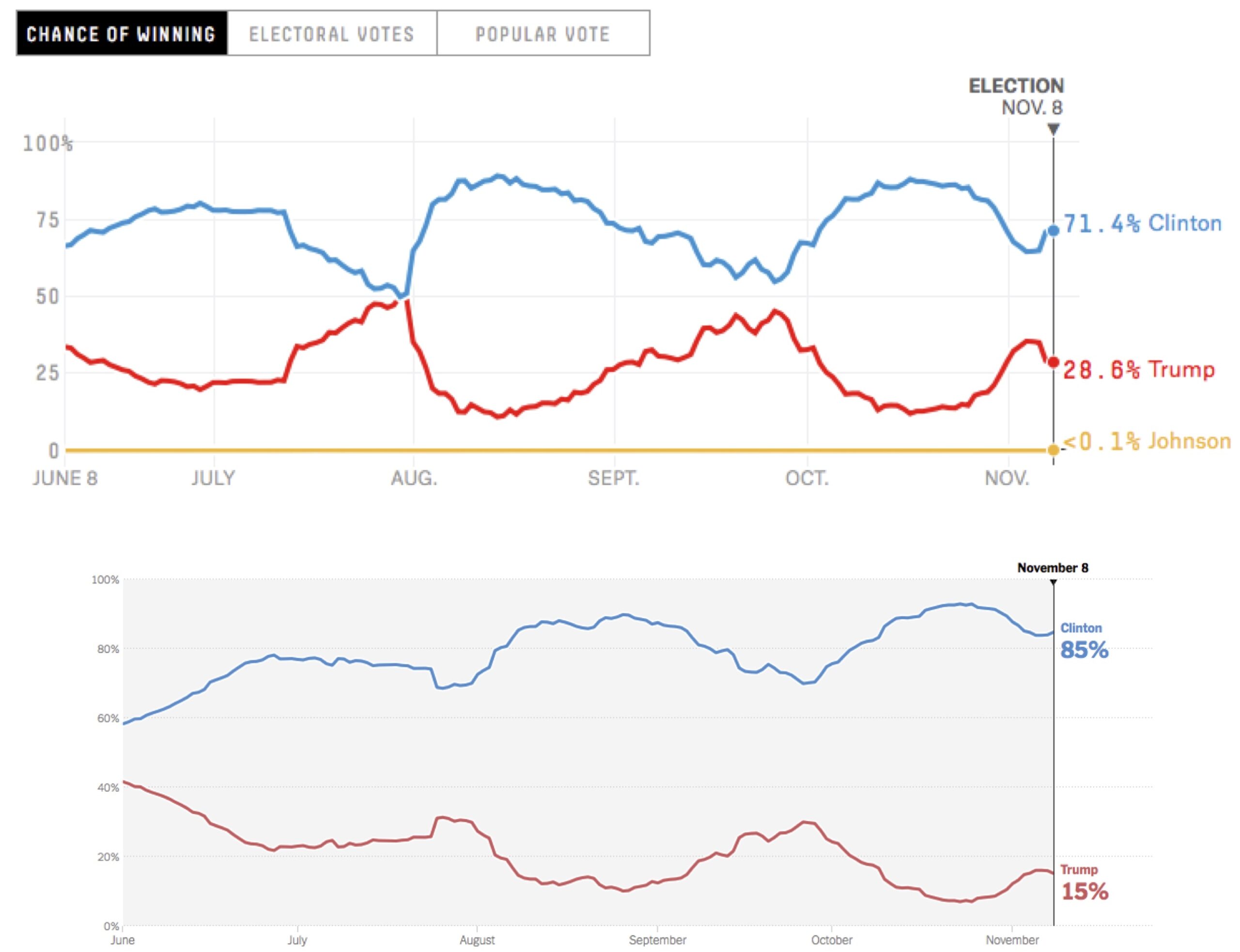
STOP: Note in the figure above that the two charts appear to have the same shape over time. Why do you think this is, and what do you think caused the projections to fluctuate?
When we observe differences between election forecasts, it should give us pause about the reliability of these forecasts. It also begs the question, “What caused the discrepancies?” To find an answer, we wonder how we might forecast an election from polls in the first place.
The dreaded Electoral College
Polls are inherently volatile. Because we are only able to sample a tiny percentage of the voting population, we can only estimate the true percentage of voters favoring a candidate. For this reason, most polls include a margin of error, or a percentage value on either side of the polling percentage. For example, a poll may indicate 51% support for one candidate with a 3% margin of error, in which case the poll projects with some degree of confidence (say, 95% confidence) that the true percentage supporting that candidate is between 48% and 54%.
We will take a moment to review how the U.S. presidential election works. Each of the 50 states, along with the District of Columbia (D.C.), receives two fixed electoral votes and a number of additional electoral votes that are directly related to their population. With two exceptions (Maine and Nebraska), each state is winner take all; the candidate who receives the most votes in a state earns all of the electoral votes in that state. There are 538 total votes (hence FiveThirtyEight’s name), and so a candidate must win 270 votes to win the presidency.
The actual election process is more complicated, since electoral votes are used to “elect” party members from the winning candidate’s party. This is by design — the Electoral College was created to provide a final barrier to prevent Americans from electing a highly undesirable candidate. In 2016, a record seven of the 538 electors defected (five Democrats and two Republicans), all of whom voted for someone who was not running in the election.
A brief introduction to Monte Carlo simulation
Because the presidential election is determined by the Electoral College, it makes sense to use state polling data to forecast the election. Our plan is therefore to simulate the election state-by-state many times, determining who wins the most Electoral College votes each time (or whether there was a tie). At the end, we can estimate our confidence in a candidate winning the election as the fraction of all simulations that candidate wins (see figure below).
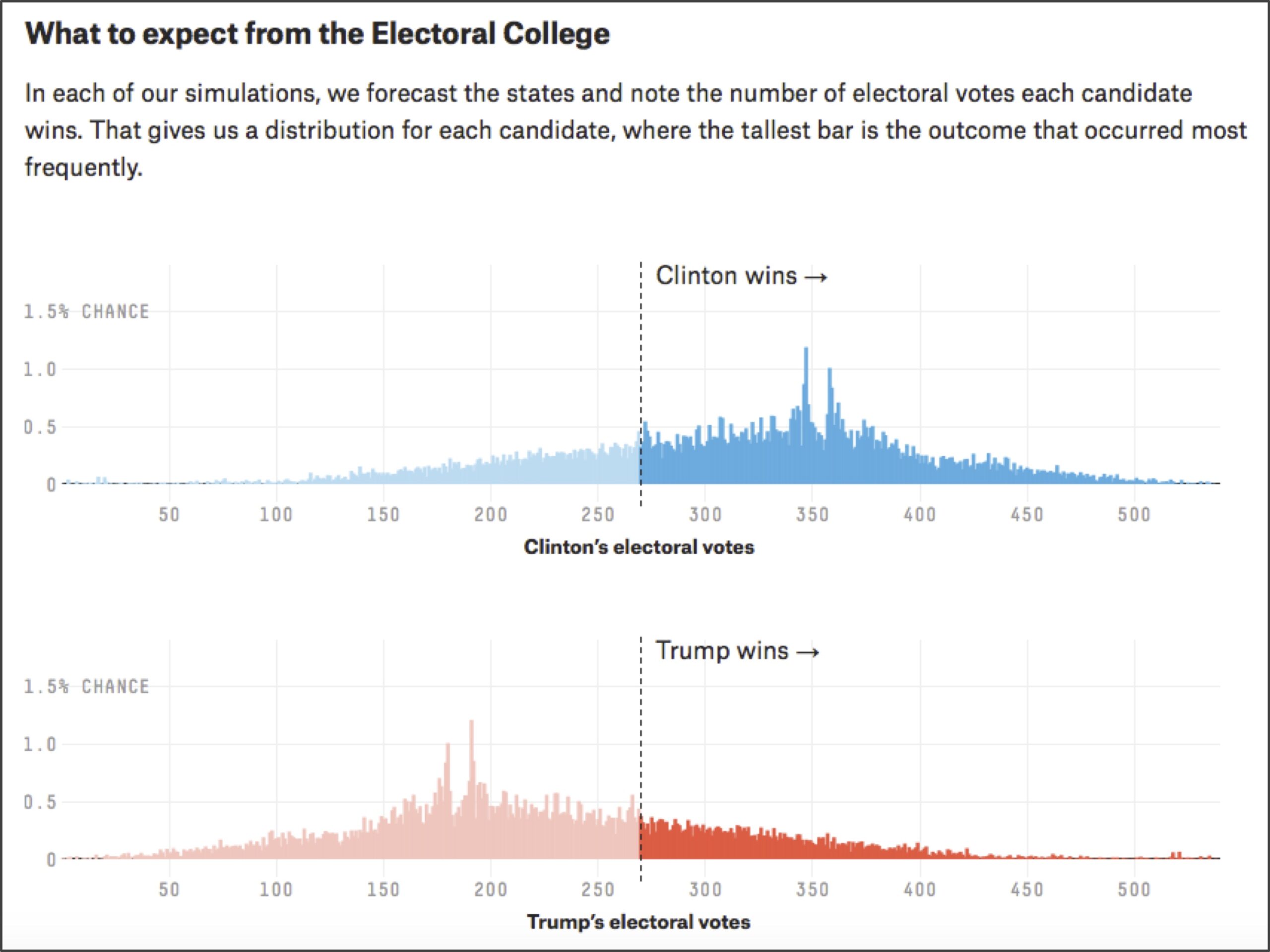
A key point is that we must allow for some variation in our simulations by incorporating randomness, or else the simulations will all turn out the same. The principle of using a large number of randomized simulations to provide an estimate of a desired result is called Monte Carlo simulation.
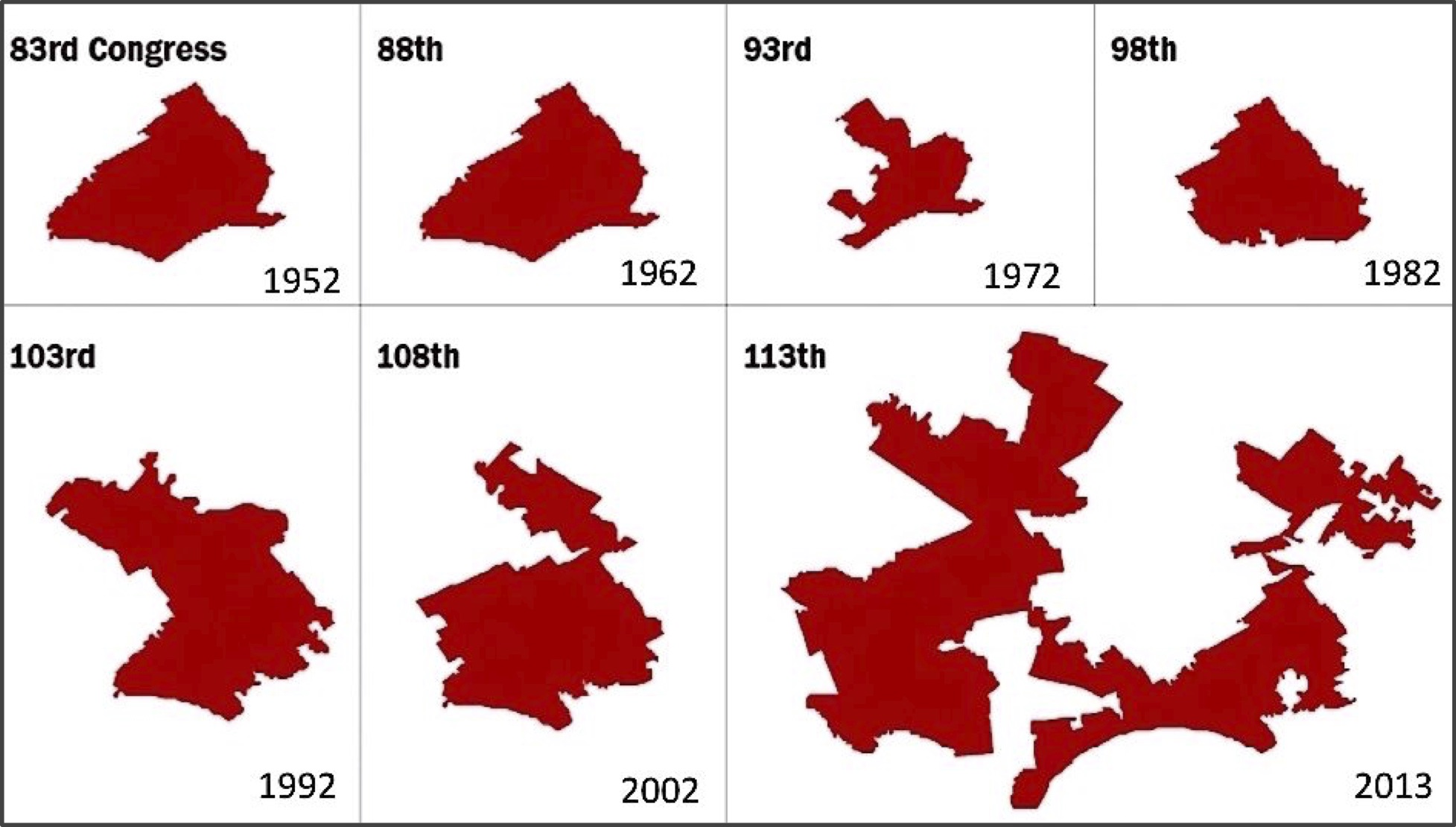
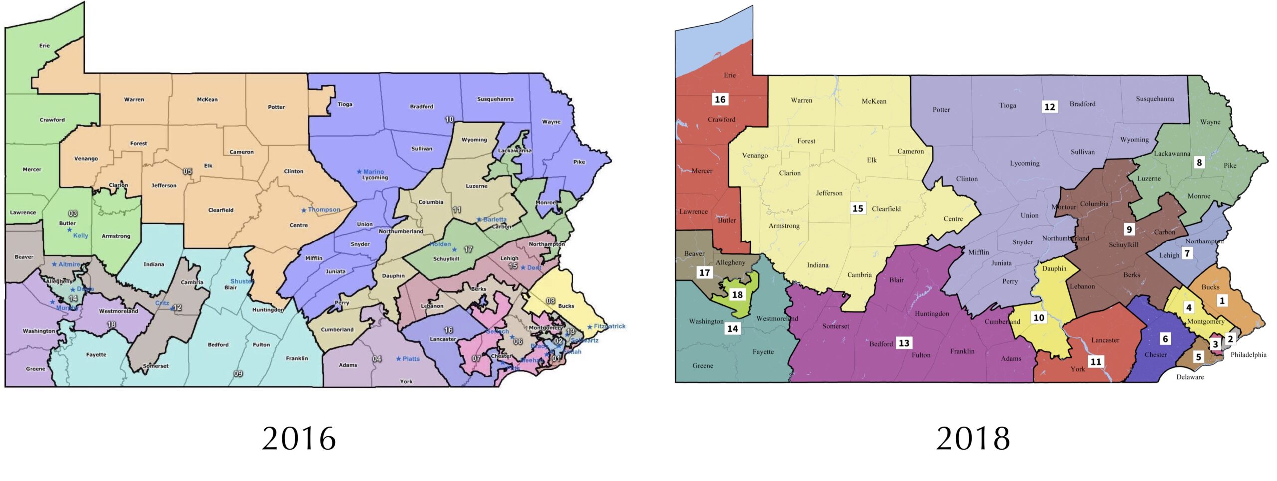
Monte Carlo simulation is ubiquitous in practical applications. When your phone tells you that there is a 40% chance of rain at 3 PM, it is because meteorologists have run many simulations and found that it is raining at 3 PM in approximately 40% of these simulations. If you want to gain an edge in a daily fantasy sports contest, you might run many Monte Carlo simulations based on previous performance to identify a strong lineup of players. And for another political example, if you wanted to prove that legislative districts have been drawn unfairly, then you could draw many political maps randomly and compare how many districts favor one party in the simulations and in reality, an argument made by a Carnegie Mellon professor that led to a 2018 redistricting of Pennsylvania (see figures below).
In this chapter, our goal is to apply Monte Carlo simulation to implement and interpret our own election forecast algorithm. But before we get ahead of ourselves, let’s learn a bit more about this approach by applying it to a simpler example that illustrates the origin of the term “Monte Carlo simulation”: casino games.