Improving our election forecast algorithm
Designing an algorithm, converting it to code, and getting the program to run does not mean that we have solved a problem. Often these tasks represent just the first steps of analyzing a dataset. To be fully fledged programmers, we must also interpret our results.
To put it more bluntly, we must ask, “Is our forecasting approach any good?” However, we cannot help but notice that our prediction is more confident in Clinton’s victory than both the New York Times and FiveThirtyEight were. What has caused this discrepancy?
| Candidate 1 (Clinton) | Candidate 2 (Trump) | Tie | |
| Early Polls | 98.7% | 1.2% | 0.1% |
| Convention Polls | 99.3% | 0.6% | 0.1% |
| Debate Polls | 99.6% | 0.4% | 0.0% |
After all, the margin of error of 10% used to produce the table above is much wider than the margin of error of most polls. It means that even if a candidate is polling at 60% in a state, a veritable landslide, there is a greater than 2% chance that our forecast will award that state to the opposing candidate. So if our forecast is more conservative in this regard than professional forecasts, why does it lean more heavily in favor of Clinton? What did the media outlets add to their forecasts that we are missing?
We will highlight three examples of how to make our forecast more robust. First, the polling data used for our forecast provides an aggregate polling value for a given state at a given time. Yet some polls may be more reliable than others, whether because they survey more people or because the poll has traditionally shown evidence of less bias.
Second, because of the small sample sizes used with polls compared to the population, forecasters typically used a bell-shaped curve that is “shorter” around 0 and that has “fatter” tails when adding noise to a polling value. Sampling randomly from a density function with fat tails allows for a higher likelihood of obtaining an adjusted polling value farther from its current value in AddNoise().
Finally, when simulating the election we have thus far treated the states as independent. In practice, states are heavily correlated; there is a very good chance, for example, that North Dakota and South Dakota will vote the same way (see figure below). Accordingly, if in a single simulation AddNoise() adjusts a given state poll in favor of one candidate, then we should most likely adjust the polls of any correlated states in favor of this candidate as well.
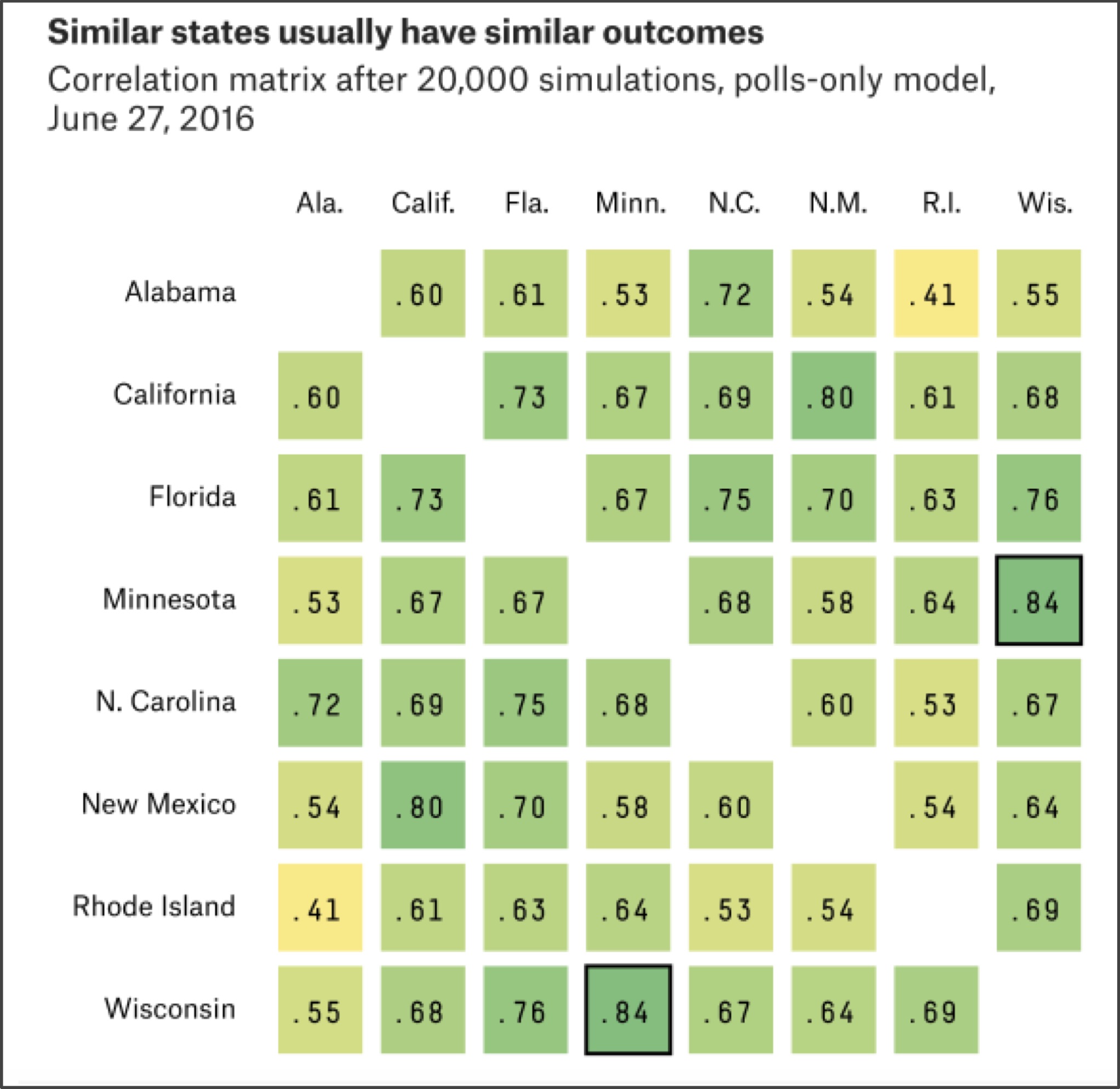
The correlation of state results makes it much more likely for the underdog to win — in 2016, Trump won most of the “Rust Belt” states stretching from western New York across the Great Lakes region into Wisconsin, even though polls indicated that he had a relatively small chance of winning each of these states.
Is forecasting an election hopeless?
We could easily add these features to improve our own forecast algorithm. However, it will be more fruitful if we take the time not to continue coding but instead to reflect on the inherent weaknesses of forecasting any election from polling data.
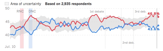
A hidden assumption of our work thus far is that responses to a poll adequately reflect the decision that respondents will make in the privacy of the ballot box. One way in which such an asymmetry can arise is if one candidate’s supporters have higher voter turnout. One national poll, the Los Angeles Times “Daybreak Poll”, was weighted based on how enthusiastic a voter was for their respective candidate. That is, a respondent could indicate 60% support for Trump, or 80% support for Clinton, rather than providing a binary response. The Daybreak Poll, shown in the figure below, consistently favored Trump in 2016.
STOP: Does the fact that the Daybreak Poll forecast the correct winner make it a good poll?
Just because a forecast is correct does not make it a well-designed forecast. For example, say that your local meteorologist may predict rain tomorrow, while your neighbor predicts sunshine based on the outcome of a coin flip. If it is sunny, you would hardly call your neighbor an expert. The Daybreak Poll’s biggest flaw is that it is a national poll despite the election being decided state-by-state. In fact, Clinton won the national “popular vote” by about three million ballots, so in this sense the Daybreak Poll was just as wrong as the other media forecasts — although weighting polls by enthusiasm is an interesting idea.
We continue the weather analogy by asking you to consider the following question.
STOP: If a meteorologist tells you that there is a 70% chance of rain on a given day three months from now, would you believe them?
We would never trust a weather forecast three months in advance, but we could probably trust knowing what time the sun will rise three months in advance. Understanding the flaw in all election simulations requires us to understand what is different about these two examples, and will take us on a detour to the stock market.
The figure below shows the prices of two stocks (called “stock A” and “stock B”) over a five-year period from January 2012 to January 2017. Imagine that it is January 2017 and we play a binary game. You wager $1 and pick one of the two stocks. If in six months time, your stock’s price has increased by 30%, then you win $5; otherwise, you lose your $1. Which of the two stocks would you choose?
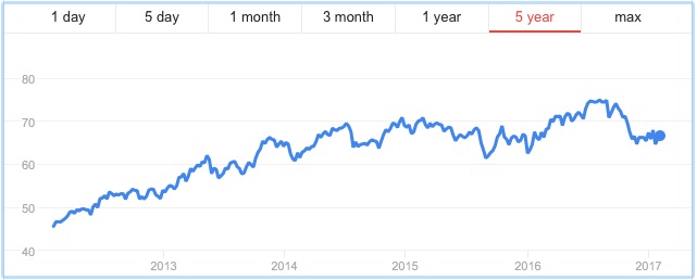
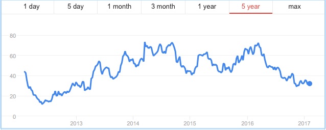
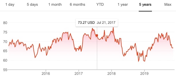
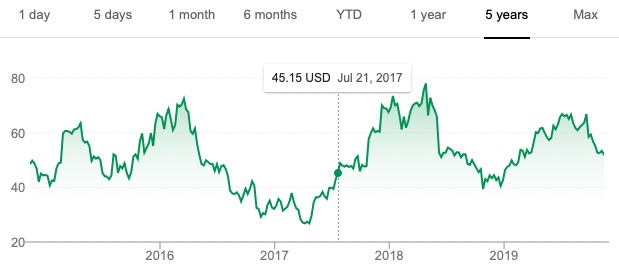
Many will pick Stock A for their wager because it has had the better performance over the previous five years. Yet you are more likely to win your bet if you choose Stock B because its price is much more volatile than Stock A. In fact, in July 2017, six months after the time of the bet, Stock A (Colgate-Palmolive) was trading for around $73 per share, a meager gain over its price in January 2017, whereas Stock B (First Solar) had rocketed up to around the $45 range (see figure below). In this case, you would have won your bet, although the stock price could just as easily have plummeted — which it did in the middle of 2018.
If you think about our binary game, in which we wager on a stock going up 30% in six months, there is not a single point in time over the last five years at which you would have won this bet on Colgate-Palmolive. The case is different for First Solar, where we find times in mid-2016, early to mid-2017, and again in late 2018 and early 2019 at which this bet would have been a winner.
These types of bets may seem contrived, but they are an example of a derivative, or an investment whose price is tied to that of some underlying asset. Our wager that a stock will increase to a certain amount K by time T is a simplified form of a European call option; if the price of the stock is x at time T, then the payout of the option is either $0 if the stock price is less than K at time T, or x–K if the price x is greater than or equal to K. And the key point is that a stock that has had higher volatility will have call options that are more expensive when K is much higher than the stock’s current price.
We can be sure about the time that the sun will rise in three months because, barring armageddon, sunrise time has very low volatility. In contrast, weather is very volatile, which makes forecasting it very difficult for the next few days, and impossible for several months in the future.
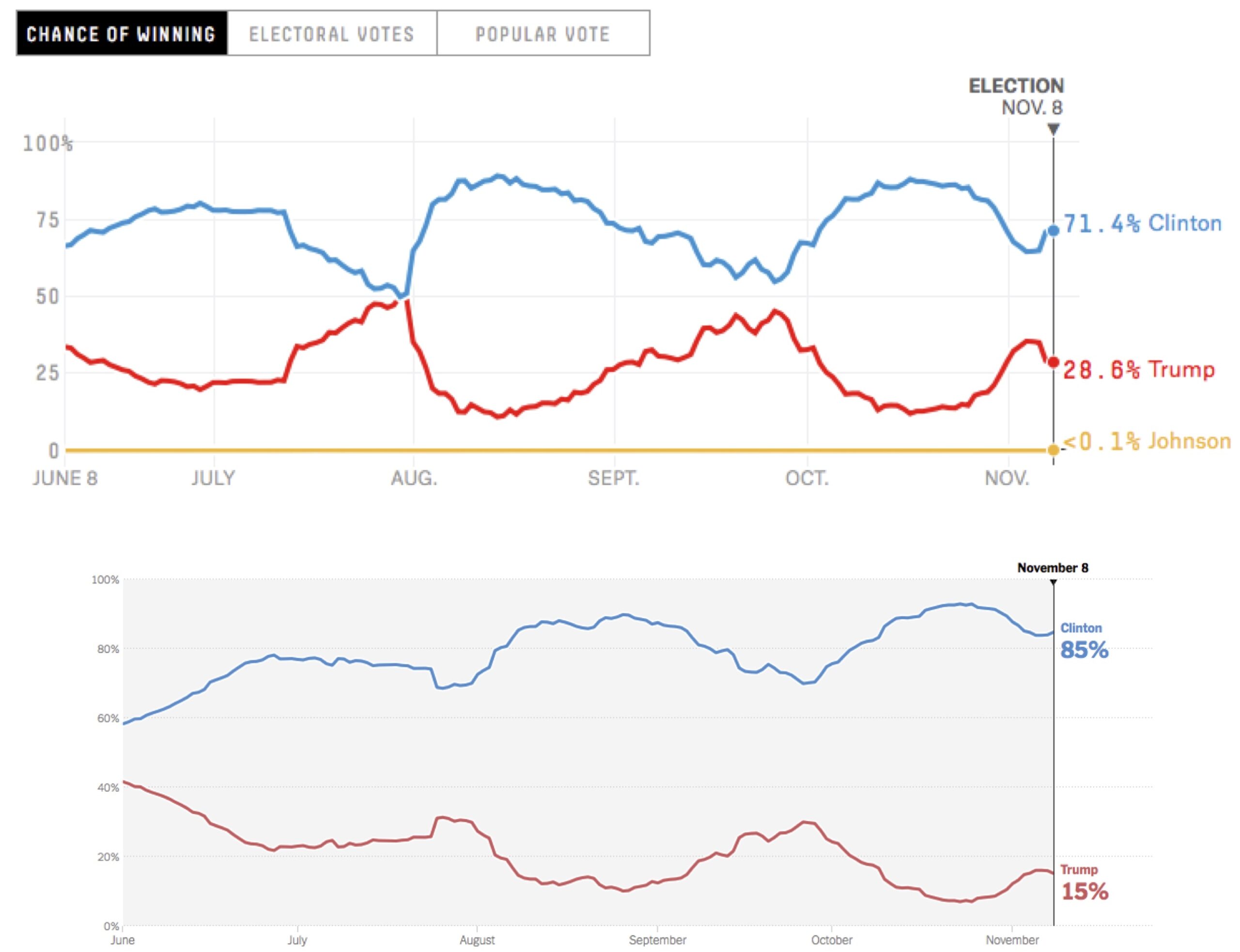
And what of election forecasting? We reproduce the FiveThirtyEight and New York Times projections below. Notice how wildly the forecasts swing back and forth; in the most notable case, an early August FiveThirtyEight forecast that was 50/50 swung back to an 80% forecast for Clinton in just a few days. These swings in the forecasts reflect very volatile polls that are influenced by news events, as well as scheduled occurrences during the campaigns such as party conventions and debates.
These media outlets built pretty data visualization on top of a fun method of forecasting an election that a novice programmer can implement with a little help. But they also made a critical error in forecasting an event far in the future based on volatile data, all while sometimes selling their work as estimating a “probability” of victory. A far better election forecast in the summer of 2016 would have been to shrug one’s shoulders and declare that predicting any future event in an environment of high volatility is no different than playing a game of chance.
Time to practice!
That wraps up our chapter on games of chance, elections, and Monte Carlo simulation. In the next lesson, you can complete some exercises reinforcing what you have learned. Or you can go ahead and check out Chapter 3, where we implement a self-replicating cellular automaton.